Zepto Product Personalizer has 22 option types. In the product editor (Product Options → Customize → Add option) they are grouped the way the picker shows them: Input (the shopper types or uploads something), Choice list (the shopper picks from choices you define) and Static (nothing to fill in — text, images and layout helpers). Each type has its own page — the Guide column links to it. Every option shares the settings in Option settings every type shares — label, required, additional charge, live preview, tooltip, hide from cart, conditional logic — and its panel has the tabs Basic, Personalizer and Advanced.
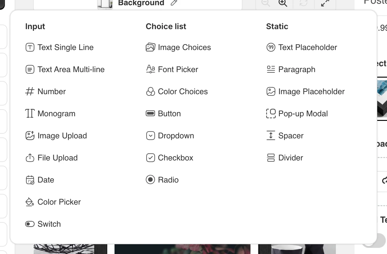
Input (9)
| Option | What it does | Typical use | Guide |
|---|---|---|---|
| Text Single Line | One line of text typed by the shopper, drawn on the product in the font, size, color and effects you set. Character limits, allowed characters, case, curve/tilt. | Names, dates as text, short messages. | Text Single Line guide |
| Text Area Multi-line | Several lines of text with a line count and line height; the limit applies per line. | Poems, addresses, long messages. | Text Area Multi-line guide |
| Monogram | A Text Single Line set to 2 or 3 letters, each letter with its own font, size, case and position. | Classic initials on towels, bags, jewellery. | Monogram guide |
| Number | Digits only, drawn like text; optional multi-line. | Jersey numbers, years, counts. | Number guide |
| Date | A date picker; the chosen date is drawn in the format you pick (8 formats). | Wedding dates, birthdays, “Est.” signs. | Date guide |
| Image Upload | The shopper uploads a photo that is placed in the area you drew; crop, aspect lock, minimum size, mask through the default image. | Photo gifts, mugs, canvases, pet portraits. | Image Upload guide |
| File Upload | One or more files (PDF, AI, EPS, PSD, DOCX, ZIP …) attached to the order, not drawn on the preview. | Print-ready artwork, logos, name lists. | File Upload guide |
| Color Picker | Any color from a color wheel, applied to connected text or image fields. | Free color choice for text or a colorizable part. | Color Picker guide |
| Switch | A yes/no toggle with the values written on the order; can carry a price when on. | “Add gift wrap?”, “Engrave the back?” — and as a trigger for conditions. | Switch guide |
Choice list (7)
| Option | What it does | Typical use | Guide |
|---|---|---|---|
| Image Choices | Swatches from an Image Set; the chosen image is drawn on the product. Prices and linked variants per image, tags, multi-select layouts, swatch slider. | Clip-art, charms, designs, patterns, product colors as pictures. | Image Choices guide |
| Font Picker | Lets the shopper choose a font from a Font Set for one or several connected text fields. | One font choice shared by first and last name. | Font Picker guide |
| Color Choices | Swatches from a Color Set; colorizes an image (the product part, a text stroke) in the live preview. | T-shirt body color, strap color, outline color. | Color Choices guide |
| Button | Pill buttons from an Option Set; one or several (min/max) selections; price or linked variant per choice. | Size, material, placement. | Button guide |
| Dropdown | The same choices in a select box with a placeholder. | Long lists: 20 sizes, 40 fonts. | Dropdown guide |
| Checkbox | A single tick box, or one per row of an Option Set (vertical or horizontal) with min/max. | Add-ons: gift box, rush order, extra charms. | Checkbox guide |
| Radio | One visible choice from a list; choices from an Option, Image or Color Set. | Short lists where every choice should be seen. | Radio guide |
Static (6)
| Option | What it does | Typical use | Guide |
|---|---|---|---|
| Text Placeholder | Fixed text drawn on the product that the shopper does not type; can follow a connected font/color picker; can act as a watermark. | “Est.”, “&”, a slogan, a SAMPLE stamp. | Text Placeholder guide |
| Paragraph | Formatted text between the options on the product page. | Instructions, size notes, delivery promise. | Paragraph guide |
| Image Placeholder | A fixed image layer: mockup, frame, logo, mask or watermark; can be colorized and shown conditionally. | Variant mockups, photo masks, overlays. | Image Placeholder guide |
| Pop-up Modal | A button or link that opens a window with your content. | Size guide, font samples, engraving rules. | Pop-up Modal guide |
| Spacer | Empty vertical space of a set height. | Breathing room between groups. | Spacer guide |
| Divider | A horizontal line (thickness, style, color). | Separating sections of a long form. | Divider guide |
Which one do I need?
Shopper types something → Text Single Line / Text Area (or Number, Date). Shopper uploads a photo that must appear on the product → Image Upload; a file that must not → File Upload. Shopper picks a picture → Image Choices; a color that recolors part of the product → Color Choices (fixed set) or Color Picker (any color); a font → Font Picker. Shopper answers a question that changes nothing on the preview → Button, Dropdown, Radio, Checkbox or Switch — and use conditional logic on the other options to react to the answer. Something that is always on the product → Text or Image Placeholder. Something on the page but not on the product → Paragraph, Pop-up Modal, Spacer, Divider.